Handskar
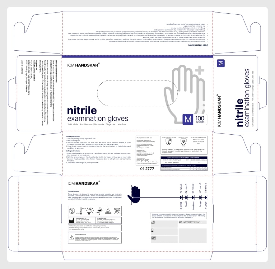
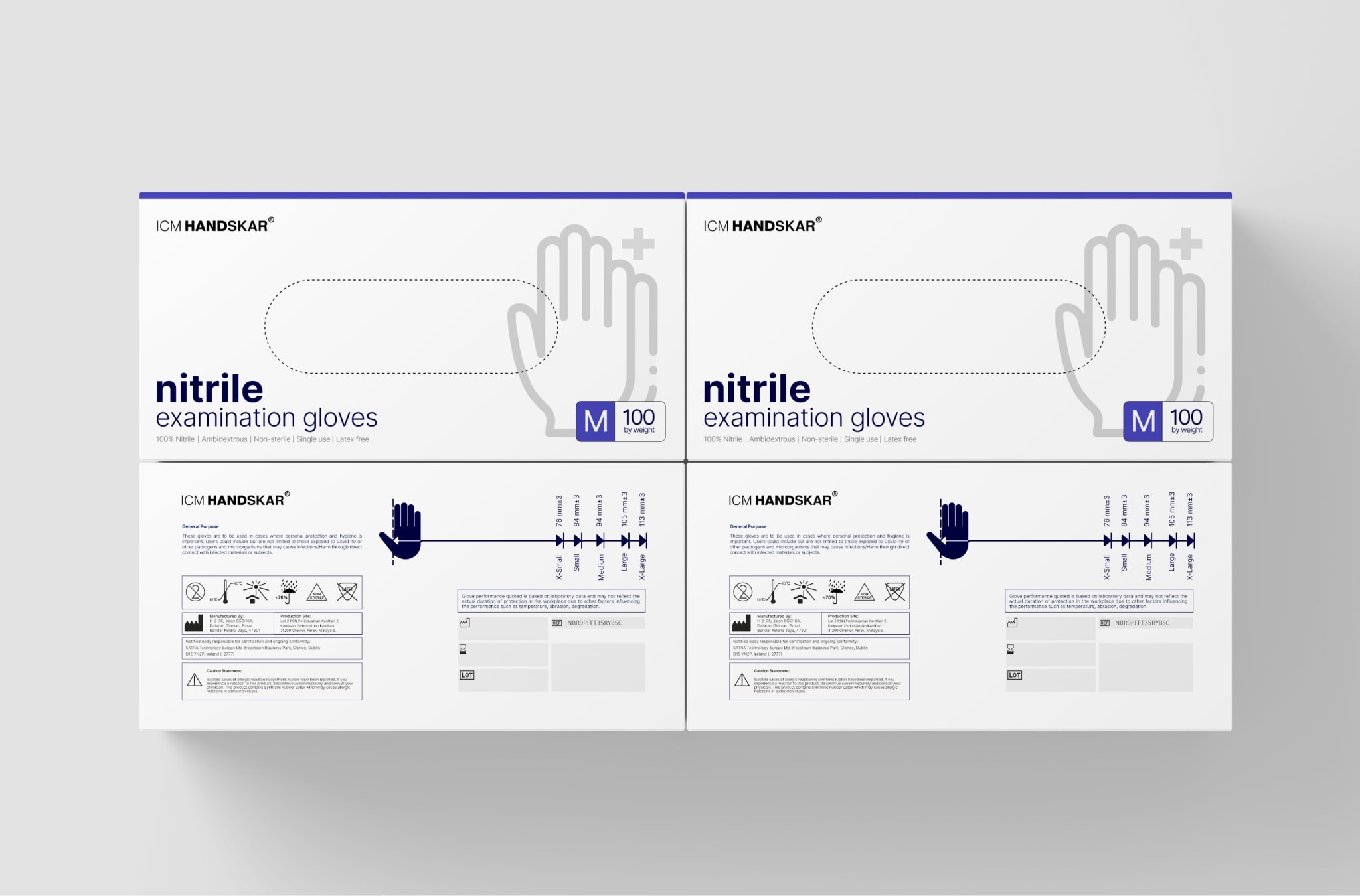
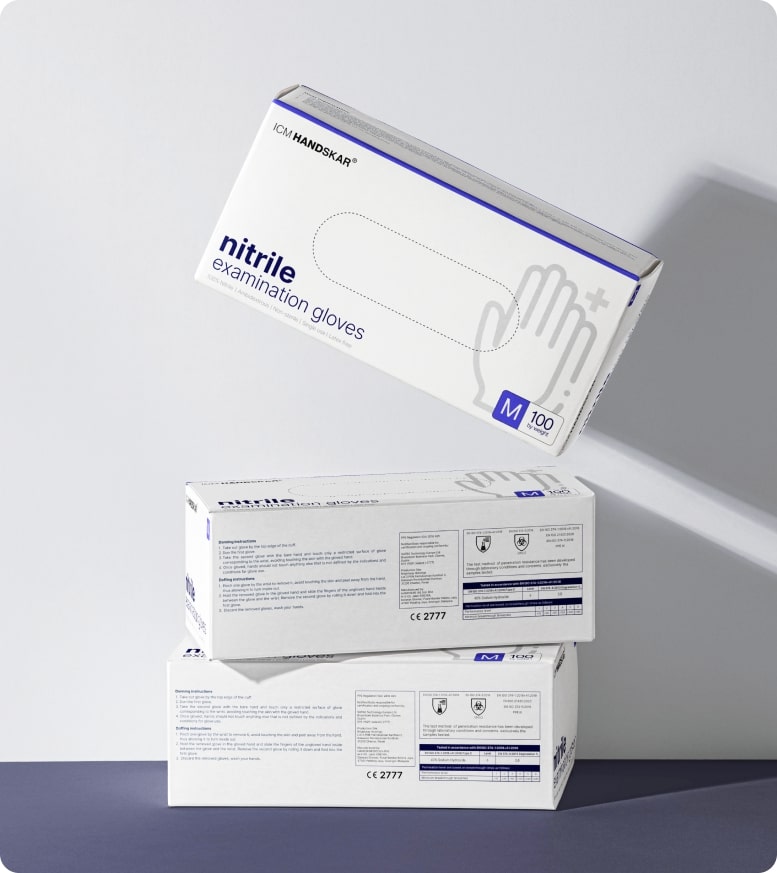
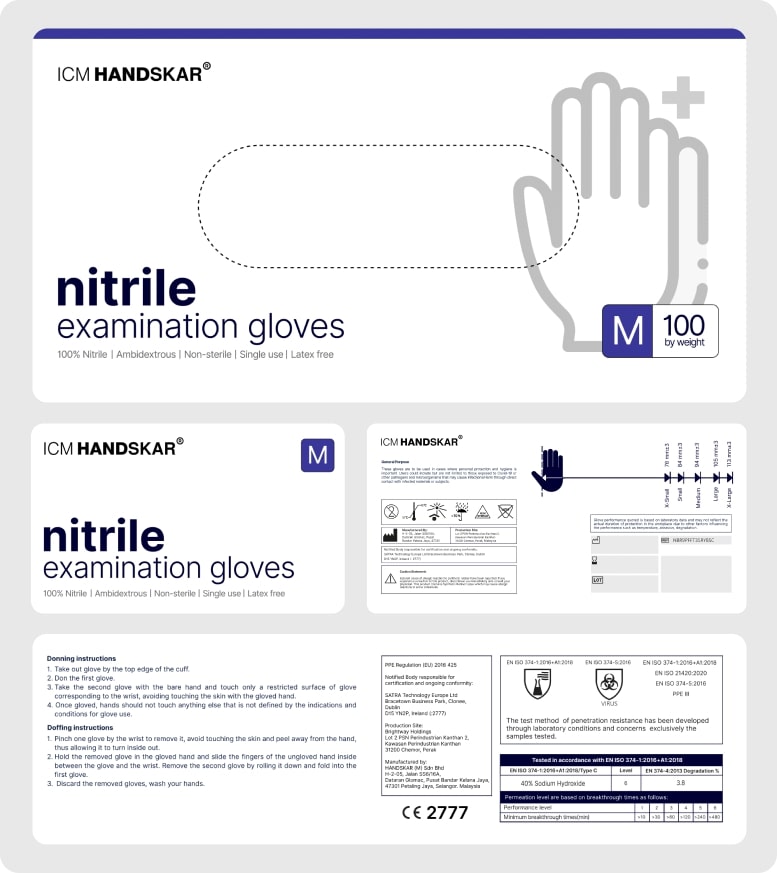
The Handskar glove box redesign project focused on elevating the brand's appeal as the company transitioned from B2B sales to a consumer-focused retail strategy. Tasked with redesigning their existing packaging, I aimed to create a visually attractive glove box that resonated with store consumers while maintaining the professionalism and trustworthiness associated with the medical field. Utilizing a color palette of blue, white, and grey, the design captured the industry’s essence while presenting a sleek and consumer-friendly look.
Project Overview
As Handskar expanded its market presence from business clients to retail consumers, the need for more visually appealing packaging became paramount. The existing design lacked the aesthetic appeal required to attract shoppers in stores. My goal was to redesign the glove box to be visually engaging, professional, and reflective of Handskar’s quality while maintaining the trust and reliability valued in the medical field.
Design Goals
The primary objectives for this redesign were:
- Create an attractive, consumer-friendly glove box design to stand out on retail
shelves.
- Maintain a professional aesthetic aligned with the company’s medical industry
background.
- Use blue, white, and grey to reflect cleanliness, safety, and trustworthiness while
ensuring visual harmony.
Design Process
I began by analyzing the current glove box and identifying its limitations in a retail environment. Research into medical packaging trends revealed the importance of clean layouts, clear branding, and visually engaging elements to attract consumer attention.
Visual Concept
The redesigned packaging embraced a modern, minimalist style with clear typography and carefully placed graphic elements to improve readability and appeal. Blue was used prominently for its association with trust, professionalism, and hygiene, while white and grey complemented it with a clean and understated look.
Typography and Branding
To create a sense of trust and sophistication, I used a modern sans-serif typeface for headings and essential product information. The brand logo was repositioned for prominence, ensuring the Handskar name remained recognizable at a glance.
Layout and Imagery
The layout balanced text, icons, and visuals, providing clarity and accessibility while enhancing consumer appeal. Product details were clearly organized, and icons highlighted key features, like "Ambidextrous" or "latex-free," to quickly communicate benefits to the user. Subtle design accents, such as gradients and linework, added depth and interest without overwhelming the clean aesthetic.
Challenges and Solutions
A key challenge was ensuring the design remained professional while appealing to retail consumers. To strike this balance, I focused on subtle details, such as modern typography and clean imagery, to appeal to shoppers while maintaining medical-grade professionalism. Additionally, I collaborated with the production team to ensure the design could be easily reproduced across various packaging sizes without compromising quality or legibility.
Outcome
The redesign transformed the Handskar glove box into a visually striking and consumer-friendly product, increasing its shelf appeal while preserving the company’s professional image. By blending clean design, a modern layout, and thoughtful color use, the final product successfully communicated trust and quality to a wider retail audience. The packaging was well-received by store consumers, reinforcing Handskar's position as a reliable and attractive choice in the medical supplies market.